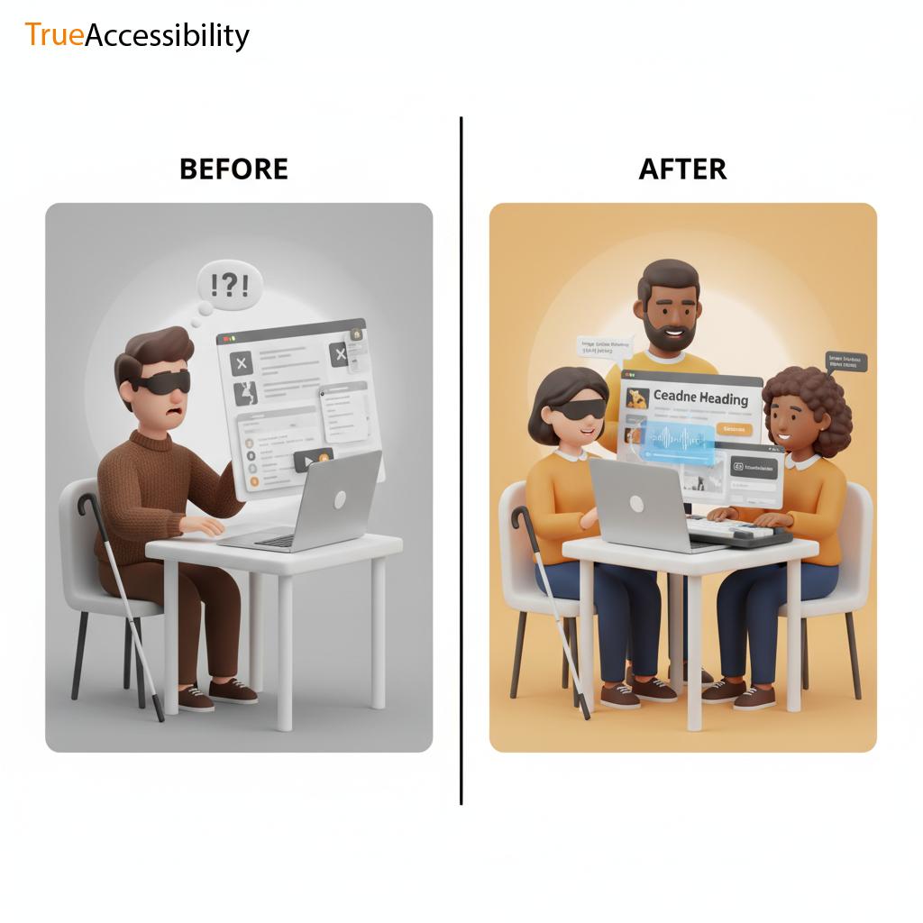
If you consider your site, you may think about how gorgeous it looks on a phone or computer and how smooth it is, or perhaps the speed at which it loads. However, the question is: can everyone actually benefit from the site?
The beauty of your design doesn't mean much when someone with visually impaired eyes can't access the menus, or the deaf person is unable to comprehend the video or the person who only has the keyboard is stuck with broken links. Accessibility isn't just a "nice-to-have" feature--it's the difference between exclusion and inclusion.
Here's the reality: many websites don't succeed, not due to the fact that their owner doesn't know the way they do, but due to basic, common errors. The mistakes that can be avoided by being aware and taking a few easy actions. This guide will help you avoid them. all about.
We at TrueAccessibility We've witnessed this kind of error pop up repeatedly across different sectors. Today, we're going to lay the errors out in plain language. Imagine this as a list of things not to take care of.
Why Accessibility Mistakes Happen in the First Place
Before diving into the specifics, let's talk about the reason these mistakes occur. In the end, no programmer or designer thinks, "Let me make this website impossible to use for blind people."
It is typically:
- A lack of understanding Most people aren't aware of what accessibility actually means.
- Prioritizing visuals over other aspects Designers usually concentrate on appearances over functionality.
- Insisting that everyone uses the same browser Insisting that all users use different ways to access the internet using keyboards, screen readers as well as voice navigation and assistive technology.
- The time crunch accessibility testing gets not done when deadlines are approaching.
- Myths Think the accessibility is "too expensive" or "only for disabled users."
What's the truth? accessible design can benefit everyone. Faster navigation, better layouts and more usability for all types of gadgets.
And ignoring accessibility? It hurts your brand's reputation as well as your image, and even the bottom line.
The Biggest Accessibility Mistakes (and How to Fix Them)
We'll look at the common mistakes that we encounter, and the easy methods to correct them.
Missing Alt Text for Images
This is the most frequent error. Alt Text (alternative text) is the word used by screen readers in order to present an image to people who aren't able to view it.
The error:
- The alt text should be left blank.
- Using vague descriptions like "image123.jpg" or "photo."
- Keywords are stuffed in instead of creating real descriptions.
What is it: Without alt text, visually impaired or blind users remain in the dark. If your website has an inventory of products, think about what it would be like when someone is unable to identify the items in the image.
The solution is:
- Always add descriptive alt text. Examples: instead of "shoes," say "blue running shoes with white stripes, brand Adidas."
- Make it brief but concise.
- To make images look more attractive You can also remove the alt attribute however only if the alt attribute is not of any value.
Inaccessible Menus and Navigation
Menus often contain dropdowns, hover effects, or even fancy scripts. However, here's the issue: Not everyone has the mouse.
The mistake
- The only way to navigate is using only a mouse.
- Dropdowns that aren't updated enough.
- Menus hidden from screen readers that they aren't able to recognize.
The reason it is important: People using only an assistive device or keyboard might not be able to access certain websites when the menu isn't accessible.
The solution:
- Verify that the menus can be accessed by using Tab key.
- Use proper HTML structure ( nav and ul elements).
- You can test using both a mouse and keyboard.
Poor Heading Structure
The headings ( H1, H2,, H3) don't only serve as a visual guideline, they're your site's map.
The error:
- Levels that are skipped (jumping between H1 and H4).
- Utilizing headings for style and not to define.
- Keywords are stuffed in, instead of giving the headings relevant.
The reason it is important: Screen readers rely on the order of headings to comprehend the flow of content. Poor structure can cause confusion.
The solution is:
- Begin with one H1 for each page.
- Then, logically, nest headings (H2s in H1s under H1, and H3s in H2s and so on).
- Be sure to keep headings that are descriptive of the contents of the section.
No Labels or Instructions on Forms
Formulations are the place where most things go wrong: sign-ups, checkouts, applications.
The error:
- Fields with no labels (just as placeholders).
- There are no clear directions.
- Error messages that do not explain why something went wrong.
What is it? Screen readers may be able to proclaim "edit field" instead of "email address field." The user may be frustrated or stuck.
The solution:
- Always put labels on your items ( Email Address ).
- Give clear directions with Examples.
- Create error messages that direct and do not confuse (e.g., "Please enter a valid email, example: name@domain.com").
Poor Color Contrast
Designers love light grays as well as pastel colors, but they forget that there are people who have poor eyesight.
The error:
- Text that blends in with the background.
- Buttons that can't be seen when bright light is present.
The reason it is important: Low contrast makes it difficult for those with visually impaired eyes -- or even tired eyes to read.
The solution:
- Use tools like WebAIM Contrast Checker.
- Be sure to follow WCAG guidelines: Minimum 4.5:1 ratio for text that is normal.
- Do not rely solely on color to communicate significance (e.g. errors, text should contain icons or other words that are not limited to red colors).
Keyboard Traps
Did you try navigating the web and ended up within a popup, or player for video? It's the result of a keypad trap.
The error:
- Interactive elements (modals or sliders) which can't be closed by using the keyboard.
The reason it is important: Users relying on the keyboard to navigate get stuck and are unable to proceed.
The solution is:
- Make sure that all interactive elements include a clearly defined "escape" method (Esc key or closing button).
- Check out every feature on the keyboard, not a mouse.
Videos Without Captions or Transcripts
They are entertaining, however when you do not provide the captions or the transcript then you exclude those who are deaf, hard of hearing or who are unable to hear in the present.
The error:
- Uploading videos that do not have captions.
- Auto-generated captions that are full of errors.
The solution:
- Make sure that the captions are accurate.
- Add transcripts for longer videos.
- Define visuals when they have significant significance.
Overcomplicated Interactions
Some websites love flashy carousels, sliders, and infinite scrolls. These look great, but they often hinder access.
The error:
- Certain elements can't be interrupted.
- Animations that do not require control.
- Unlimited scrolling Without "load more" buttons.
The solution:
- Always offer user-friendly controls (pause or stop).
- Make interactions as simple as possible.
Tests not conducted with real People or tools
Accessibility isn't just a checkbox that can be checked once. It needs to be tested.
The error:
- Testing without testing.
- Using only automated software.
The solution:
- Check with screen users (NVDA, VoiceOver, JAWS).
- Try it out using the keyboard.
- It is even better to include actual disabled users in your tests.
Why These Mistakes Are Costly
Accessibility issues aren't only a problem for users. They can hurt your health also:
- Lose customers When people are unable to purchase, they will leave.
- Legal risk Accessibility lawsuits are increasing across the globe.
- SEO penalties - Search engines reward clean, accessible sites.
- Damage to reputation Exclusion isn't an acceptable way to present yourself.
It's not just about ethics. It's a good thing for business.
The TrueAccessibility Checklist
Here's a quick checklist of the things NOT to miss:
- Always add descriptive alt text
- Create keyboards that are user-friendly for navigation
- Make sure you use the correct hierarchy of headings
- Make sure to label all forms fields with a distinct label
- Maintain strong color contrast
- Do not fall for the traps of keyboards
- Transcripts or captions of video clips
- Make interactions easy and manageable
- Experience the test with real-life people and authentic instruments
Print this. It is then saved. Send it to your team.
Final Thoughts
In the end, accessibility errors do not have bad intentions. Instead, they're about missing opportunities. Each time you leave people out, you've lost an opportunity to connect to serve and expand. These fixes aren't difficult. They usually require only an extra bit of thought. It's a huge payoff such as more clients, happier customers, a more positive image.
Here's the question: review your website today. Walk through it with new eyes. You can browse it using the mouse. Watch your video and turn the audio off. Increase the size of your screen by 200 percent. Check out what's broken.
Accessibility starts here. This is not through fancy guidelines however, but through empathy and the ability to act. Do you require someone who is aware of the pitfalls in and out? TrueAccessibility is here for you.